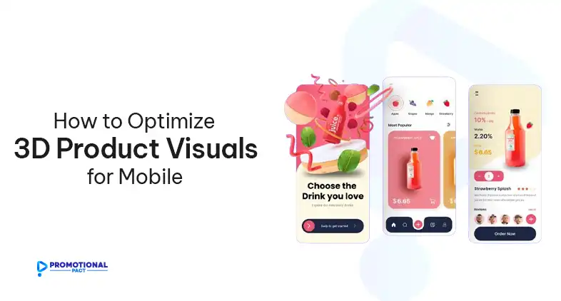
The world of e-commerce is rapidly shifting towards mobile. With over 60% of online shopping traffic now happening on smartphones and tablets, it’s essential for online retailers to optimize their sites and product imagery for these devices. This is where high-quality 3D product visuals can provide immense value, allowing mobile users to inspect products in detail and have an immersive shopping experience.
However, 3D content can be demanding on mobile hardware and networks if not properly optimized. In this article, we’ll explain the key areas where you need to optimize your product visuals for mobile optimization and how to do it.
Why Use 3D Product Visuals for Mobile E-Commerce?
Mobile commerce has experienced explosive growth over the past decade. Google data shows that over 50% of searches now originate from mobile devices rather than desktops. Consequently, having a fast, seamless shopping experience on mobile has become imperative for online retailers. 3D product imagery directly addresses many of the challenges of mobile shopping.
With 3D models, customers can examine products from all angles, see how clothes fit on virtual models, and even visualize furniture in their own rooms with AR. This results in higher engagement, lower returns, and greater confidence during the purchasing process.
However, 3D scenes can have large file sizes and be computationally intensive. Some techniques for desktop 3D don’t directly translate well to the mobile context. Optimizing 3D content specifically for mobile hardware is crucial.
Why Mobile E-Commerce Needs Optimization?

While mobile devices have improved tremendously in performance, they still face constraints compared to desktops when rendering detailed 3D environments.
Phones have less processing power, so scenes with millions of polygons will cripple framerates. Lower network bandwidth slows the loading of large assets like high-resolution textures.
Battery life drains rapidly during prolonged 3D rendering. Smaller screens reduce UI legibility and precision of touch controls. These constraints require optimization so desktop-quality 3D assets translate smoothly to the mobile experience.
Techniques like reducing polygons, compressing textures, simplifying materials, and profiling target devices are essential to delivering performant and usable 3D shopping on mobile. Without modification, desktop 3D content often provides subpar visual quality, speed, and interaction on mobile.
How to Optimize 3d Product Visuals for Mobile E-Commerce?

Multiple strategies across 3D modeling, rendering, and mobile content delivery can overcome device limitations and provide smooth 3D e-commerce experiences.
Model Optimization
Reducing the polygon count and texture sizes of 3D models improves mobile performance drastically while retaining visual quality.
Polygon Reduction
Simplify highly detailed models using techniques like decimation to optimize polygons while preserving shape. Use retopology to intelligently rearrange topology.
Texture Optimization
Scale down high-resolution textures because imperceptible details are lost on small screens anyway. Use normal maps to simulate geometry and texture compression to minimize size
Material Optimization
Use efficient materials like PBR that uses smart shading techniques that minimize render cost while still appearing realistic.
Level of Detail (LOD)
Use separate model versions for different viewing distances where nearby models will have more detail but distant ones will use simplified geometry.
User Experience Optimization
Beyond the 3D assets themselves, the controls, interface, and content presentation require mobile-focused UX design.
Intuitive Touch Controls
Design buttons, sliders, and gestures specifically for touch to provide easy navigation of the 3D models.
Responsive Design
Adapt text and UI to reflow correctly across many screen sizes. Make sure that button sizes and text are legible on small screens.
Fast Loading Times
To ensure snappy loading, optimize and cache assets to compress content delivery. Faster loading also ensures smoother transitions between product views.
Mobile-First UI
Follow a mobile-centric information hierarchy interface for clear calls to action that guide users efficiently through product information.
Content Optimization
Supplementary product content should complement 3D visuals for a well-rounded mobile experience.
High-Quality Product Photos
Use crisp 2D photographs and augment 3D models with real-world lighting context. Also, optimize images for smaller screens.
Clear Product Information\
Optimize descriptions, technical specifications, and customer reviews and format them for easy mobile reading. Remove unnecessary and less important text elements.
Prominent Call-to-Action Buttons
Place primary actions like “Add to Cart” using large, high-contrast buttons consistently for easy access.
Advanced Mobile Optimization Techniques for 3D

Implement Augmented Reality
Use AR to overlay 3D models on the real environment for tangible scale and context. AR aligns lighting and shadows to match the physical space.
Keep AR model polygons and textures low. Leverage mobile AR SDKs like ARCore and ARKit which optimize tracking and rendering. Design interactions around device motion like walking around the product.
Build Product Configurators
Allow customizing variations of products in real-time with parametric 3D models. Drive parameters through intuitive controls to modify colors, materials, and textures.
Use efficient rendering techniques like static and dynamic batching to update config changes rapidly. Take advantage of native multithreading on mobile chipsets.
Precompute multiple configurations and use GPU instancing to switch between them instantly. Group configurable parts into sub-models for efficient manipulation.
Boost Performance with WebAssembly
Improve rendering times by using WebAssembly for intensive 3D computations. Compile C/C++ or Rust code to WASM and integrate it into JavaScript.
Offload tasks like physics simulations, scene lighting, and model animations to WASM. Draw commands can be batched for fewer JavaScript calls.
Profile regularly as WASM support expands. Browser optimizations may reduce the need for hand-ported code over time.
Continuously Profile on Target Devices
Frequently test performance on a range of target mobile hardware. Measure FPS, UI responsiveness, and loading times.
Monitor phone thermals and battery usage. Tune visual quality to optimize for extended mobile usage.
Ensure optimizations integrate well with product customization and AR flows. These immersive interactions require maintainable performance.
Testing and Measurement
Ongoing testing provides the data needed for continual improvement of the mobile 3D experience.
A/B Testing
Create variations of 3D visuals changing factors like image quality, loading animations, and ease of interaction.
Show statistically significant groups of users with different variants and compare conversion rates. This quantifies the impact of changes.
Iterate on underperforming areas until an optimal experience is reached based on hard metrics.
Performance Monitoring
Profile rendering speed, loading times, and frame rates on a range of devices from low to high end.
Identify performance bottlenecks – are complex models, textures, or shaders the issue? Tune accordingly.
Check thermals and battery usage. Optimize to avoid overheating devices and excessive power drain.
Summing Up
Mobile e-commerce dominance provides a compelling opportunity to leverage 3D’s power for more immersive shopping experiences. But simply reusing desktop 3D content neglects the specific demands of mobile devices and networks. With deliberate mobile-focused optimization across assets, UX, and advanced features, the benefits of highly interactive 3D product visuals can be unleashed effectively on smartphones and tablets.